My Top 10 Favourite Album covers (part 3)
In this edition of my Top 10 Favourite Album Covers, we’re down to the final four. If you’re just joining now, this is a series of posts where I’ve been counting down my favourite album covers to give you a sense of what inspires me visually and how I think about art. Looking at the artwork I love is one of the best ways to understand the kind of art I want to create, so let’s get into it. Here are numbers 4 to 1.
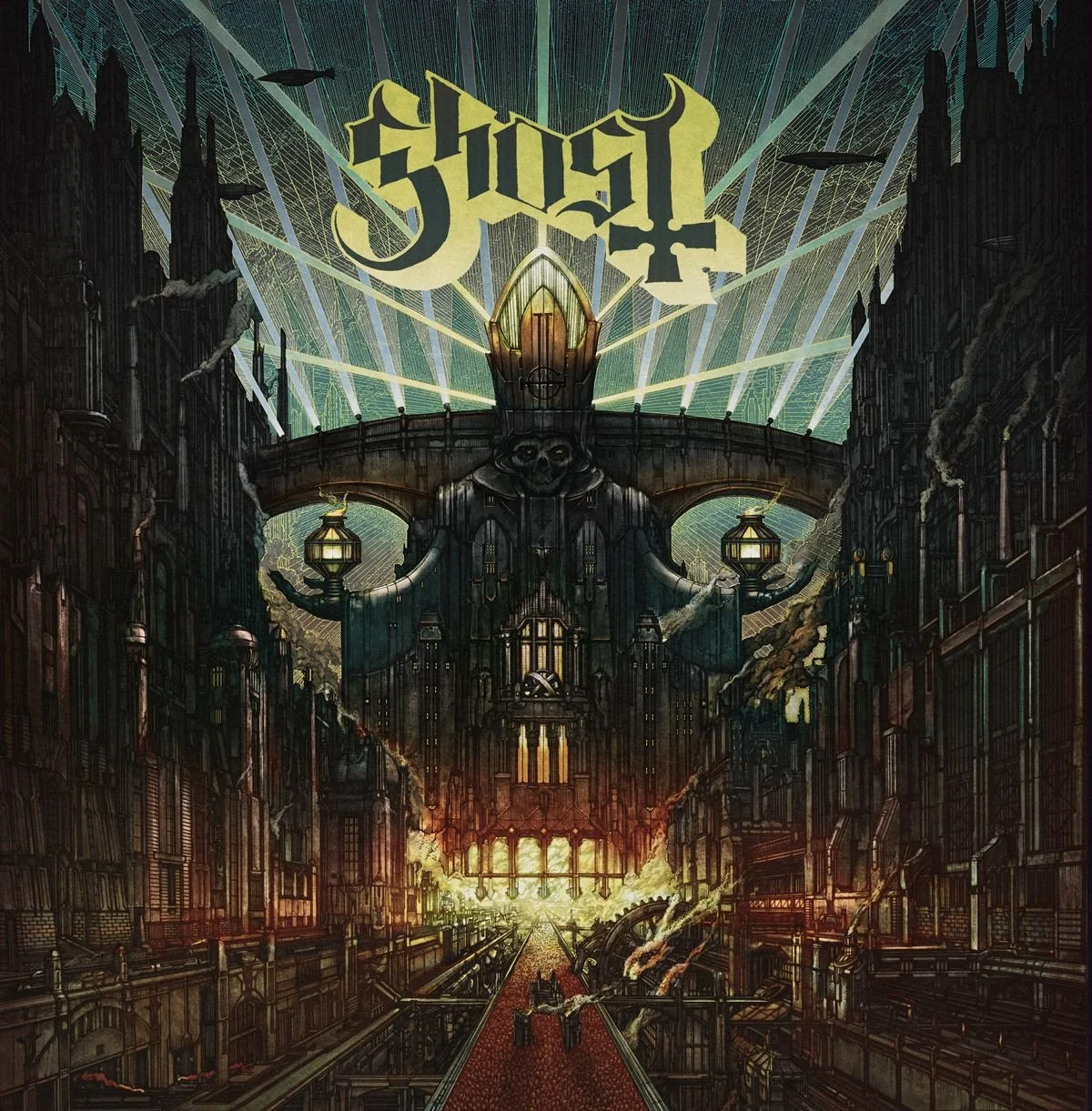
4. Meliora – Ghost - Artist: Zbigniew M. Bielak
It honestly wouldn’t be a stretch to say that every Ghost album cover since Meliora in 2015 could’ve made this list, but this one’s definitely my favourite. It’s such a striking, dystopian image, full of atmosphere and scale, perfectly mirroring Ghost’s theatrical, larger-than-life sound. What I love most is how it functions on different levels, at a glance, the skull shape formed in the architecture grabs you instantly, but the closer you look, the more fine detail you see. The delicate linework and layered intricacy is the kind of thing a lot of artists dream of achieving. It’s one of those rare covers that’s just as impressive from a distance as it is up close.
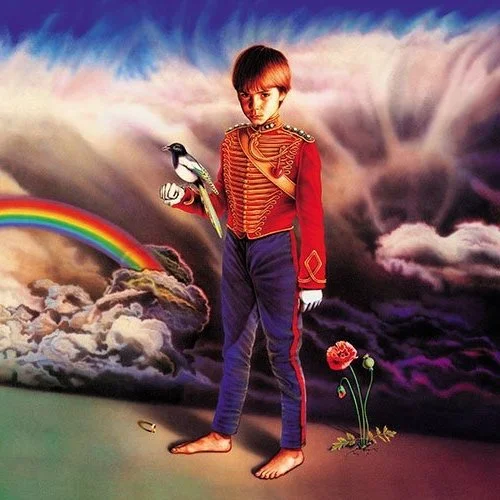
3. Misplaced Childhood – Marillion - Artist: Mark Wilkinson
Mark Wilkinson is easily one of the greats when it comes to album art, and a massive personal favourite of mine, so it’s no surprise to see one of his pieces in my top three. The concept of this one is what really sets it apart for me. Every element has symbolic weight, many of them tying back to Marillion’s earlier records. I love how it plays with contrasts, innocence vs guilt, childhood vs adulthood. The boy in a military uniform says so much with so little, and the poppy growing from the ground reflects both life and death. The airbrush work, too, is immaculate, it’s smooth, polished, and so classically Wilkinson. A truly thoughtful and layered piece.
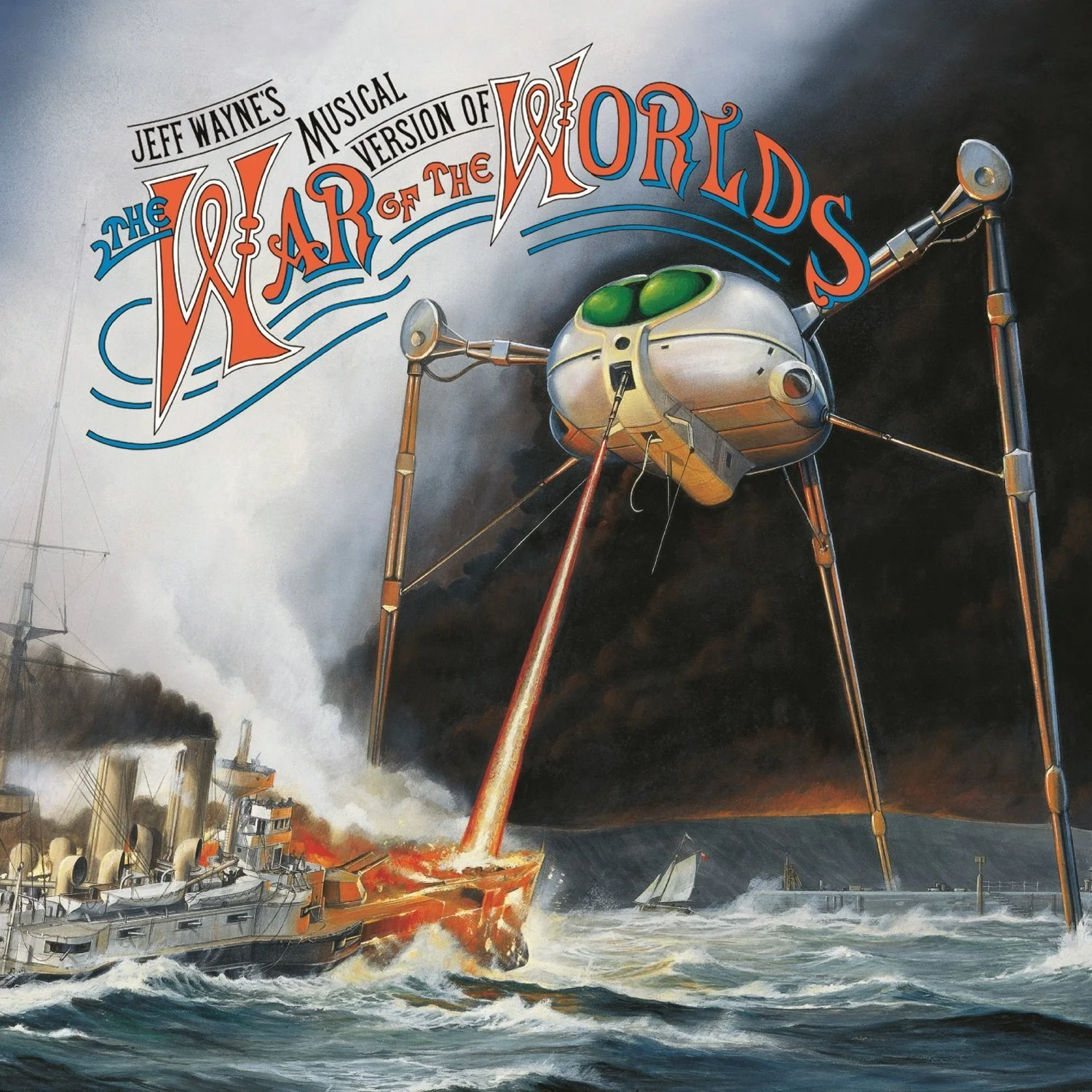
2. The War of the Worlds – Jeff Wayne - Artist: Mike Trim
I can’t overstate how much this album cover shaped my love of music artwork. I remember seeing it for the first time when I was around four or five, and it genuinely scared me. The Martian war machine with its insect-like eyes and towering, alien stance over the melting remains of the Thunder Child, it just stuck with me. That sense of something so completely beyond human comprehension and power really hits home. And it’s not just the cover, the whole package is stunning. The inner sleeve and booklet feature multiple illustrations that bring the story to life. For me, it’s the gold standard of what a complete album art experience should be.
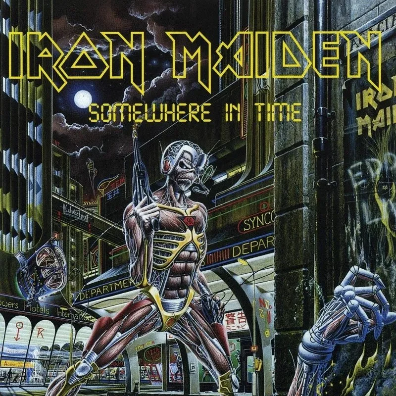
1. Somewhere in Time – Iron Maiden - Artist: Derek Riggs
This is the one. My number one favourite. Somewhere in Time ticks every single box for me: epic storytelling, incredible detail, and layer upon layer of hidden meaning. Every time I look at it, I spot something new, a reference to Maiden’s history, a nod to sci-fi classics, a clever visual pun. It’s a masterclass in how to build a world on a single image. Nothing in the artwork is random, everything is deliberate, thought through, and placed with purpose. It’s a tapestry of meaning that completely captures the spirit of Iron Maiden. For me, that’s what great album artwork should do, reflect the music, deepen it, and live alongside it as part of the experience. That’s why this sits at the top of my list.
I hope you’ve enjoyed following along with this series on my favourite album covers. Maybe it’s even sparked a bit of reflection about the ones that have stayed with you. Which cover stopped you in your tracks the first time you saw it, whether that was in a record shop or on a streaming platform? What does that artwork mean to you on its own, and how does it change when paired with the music it represents?
And finally, what’s your favourite album cover?